The Samsung Galaxy S6 and S6 edge Review
by Joshua Ho on April 17, 2015 9:00 AM EST- Posted in
- Smartphones
- Samsung
- Mobile
- Galaxy S6
- Galaxy S6 Edge
Software
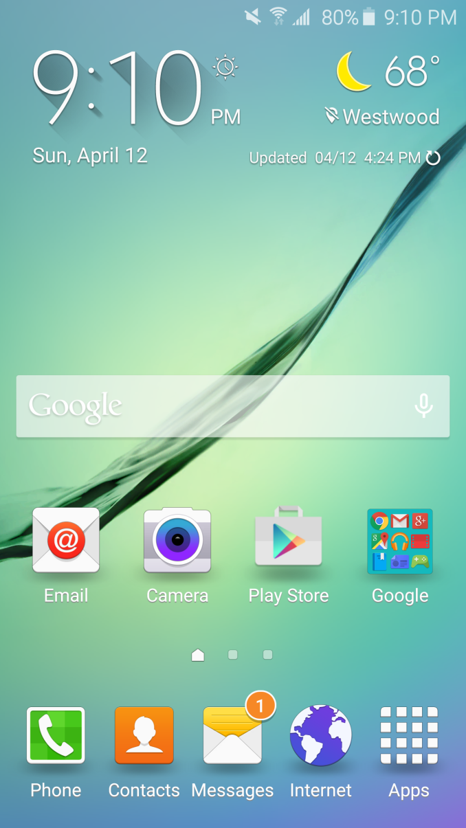
Hardware is undeniably crucial to supporting a good user experience, but without good software to take advantage of the hardware it’s easy to make an unusable phone. However, trying to determine what qualifies as good software is often strongly subjective. There is a significant portion of users that believe any deviation from the Google Play/Nexus experience represents a negative, but in general OEMs seem to be convinced that it is necessary to differentiate their devices by modifying Android to fit their own vision for user experience. This can range from Motorola’s near-stock UI with custom applications and features designed to complement stock Android, to TouchWiz and Sense, which completely reskin Android and a set of custom applications that have a unique look and feel. In the case of the Galaxy S6, Samsung has lightly updated TouchWiz from its Galaxy S5 redesign to try and fit in with the Material Design update.
One of the most immediate aspects of the TouchWiz experience is the aesthetic design of UI. Fundamentally, not much has really changed here when compared to the Galaxy S5. Although TouchWiz was a huge step forward at the time, there were still some issues that included some Éclair-style tabs throughout the UI that required tapping the top tab rather than edge swipes that have become a staple in Android app navigation. Unfortunately, this remains in some rather prominent places like the dialer.
To be fair, Samsung has done a great deal to update the applications in TouchWiz to appear to follow Material Design. But fundamentally it seems that they’ve missed the point to some extent as applications like the email client appear to mostly match Material Design, while other aspects like the overflow menu and the floating action button (FAB) are noticeably different from how most Android applications behave.
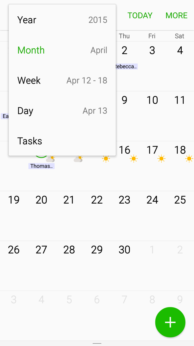
For example, the mail application’s overflow menu is a drop-down menu that must be opened by tapping the top left area of the display, rather than a slide-out menu like Gmail. The animations associated with tapping the FAB in the mail application appear to simply fade in a new window rather than sliding into the window. These issues also extend to areas like the clock, calendar, gallery, and most commonly used applications. The clock is also notable for not having edge-swipe gestures to move from one tab to the next, and retains some odd skeuomorphic elements as the alarm and timer are both flip clocks.
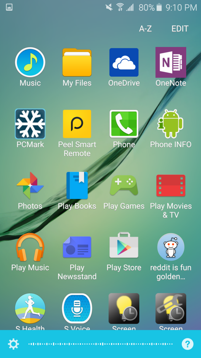
TouchWiz's icon design also feels a bit dated at this point, and could use a refresh to better fit with everything else in Android. Custom themes could be a solution, but in my experience it’s exceptionally rare for end users to make a theme that is any better than what an OEM could produce. There are also some functional problems like not being able to access albums other than the camera roll when accessing the gallery from the camera and the inability to force alphabetic ordering of all applications in the app drawer. The latter is a serious usability issue as it's really rather annoying to have to constantly tap the A-Z sort button every time I install a new application.
Outside of these design issues, TouchWiz is now a surprisingly usable experience. I no longer need to immediately disable S-Voice activation on double-clicking the home button or deal with a laundry list of applications that will never be relevant, and S-Voice itself has a significantly improved user experience as it solely relies on voice activation using a trained phrase. This activation is accomplished using Audience’s eS804 chipset on the T-Mobile review unit, but appears to be done through the Wolfson audio processor on variants that don’t use Audience’s voice processor. I’d still rather have Google Now native voice activation, but S-Voice works surprisingly well in this iteration.
On the performance side of things, the Galaxy S6 provides a noticeable improvement in responsiveness over the Galaxy S5 in some critical areas where the Galaxy S5 fell short. The multitasking menu is now significantly faster compared to the Galaxy S5 on Lollipop, and in general things are noticeably smoother. I suspect most people won’t be able to tell a difference at this point, but in general UI performance is about comparable to the One M9. Both phones are somehow a bit slower than the Nexus 5 in general UI use, which is probably due to differences in governor settings and code performance. I did some simple logging of CPU frequency of both clusters over time and it appears that Samsung is migrating threads to the A57s any time the display is touched, which could be affecting responsiveness when UI threads are bouncing between cores.
The fingerprint sensor is easily the stand-out feature here, as Samsung has finally put some real thought into the software side of things. Unfortunately there’s still no API here to enable third party applications to take advantage of the fingerprint scanner, but Samsung has included authentication for saved passwords on the browser, which works painlessly and avoids some of the security problems with saving login information on the phone. The setup and operation of the fingerprint sensor in general is painless compared to the fingerprint sensor of the Galaxy S5, which was bad enough that it was often slower than a pattern for unlocking the phone and had no real use outside of unlocking the phone. It’s hard to argue that the iPhone 5s wasn’t the impetus for this feature though, as the 18-24 month development cycle of a phone suggests that this was a fast-follower move rather than an independent development at Samsung.
Overall, although there are some issues with the polish of TouchWiz it’s definitely good enough to use on a daily basis. It’s still not as polished as some other UIs, but it’s 95% of the way there. Samsung has managed to provide useful features and dial back much of the unnecessary clutter of previous iterations. Aesthetically speaking there are some imperfections, but there are no major impedances on usability the way there was in TouchWiz on the Galaxy S4. With some further iteration and improvement, I’m sure TouchWiz could become a selling point for the phone as opposed to not detracting from the experience.


306 Comments
View All Comments
Inteli - Friday, April 17, 2015 - link
While no removable battery is workable (if disappointing), I dislike the removal of the SD Card slot in favor of being more iPhone-like, since it allows for more storage (and I don't have to worry about clearing stuff out for updates). Hopefully Samsung won't go this way with the Note 4, or else that might very well be my last Samsung phone.Inteli - Friday, April 17, 2015 - link
And by Note 4, I meant Note 5.Vandam500 - Friday, April 17, 2015 - link
I doubt it man. The Note 5 will likely be very similar to the GS6 which means no removable battery and no microSD card slot.mindracer - Friday, April 17, 2015 - link
I have a feeling Samsung will keep the Note series as it's "productivity/business class", be like the GS6 but with removable storage and battery, and make the GN5 the top of the line in design and features for the real heavy user.Solandri - Friday, April 17, 2015 - link
What I don't get is, Samsung makes like two dozen different smartphones. Why can't they make two top-tier phones - one with the "everything sealed" philosophy and another with the "user can replace the battery and microSD card" philosophy, both using the same screen, processor, camera, etc.?lyricalsaint - Friday, April 17, 2015 - link
Probably because Apple has been so successful with marketing theory, and Samsung wants to copy their concept of giving consumers limited choices. Too many choices can put people into somewhat of a decision paralysis.Gigaplex - Friday, April 17, 2015 - link
But it's too late for that, Samsung already has too many choices.joos2000 - Saturday, April 18, 2015 - link
It isn't hard to cut models to reduce choice really. They can slim down their product line in months.MacDaddy100 - Friday, April 24, 2015 - link
It's not a marketing theory, its not many people give a rats a$$ about removable batteries and upgrade memory cards, I plug my phone in at night like 99% of the people do, I have 128gb of internal memory that hold my 10K (High Bit Rate) song library with room left over that very few people even want to do with Pandora and such that don't need the internal memory. Quit living in the 90s, everything thing is online, or in the cloud now.peterfares - Saturday, April 25, 2015 - link
So then why didn't you just get the 32GB model?